Last week, we launched a totally redesigned Steamclock website and branding. We think it’s neat, so here’s a bit about it.
The Braaand
It’s easy to go overboard on value statements and brand visions. “Our mission is to optimize synergy for shareholders,” sure great – very inspiring. When it comes to doing design and branding work though, it is really helpful to lay out what the message is. What is Steamclock about?
In their briefest form, here are the 3 adjectives we built the Steamclock brand around, and the three “guardrail” terms we wanted to stay cautious of:
- High quality, but not corporate.
- Playful, but not wacky.
- Nice, but not fancy.
With these in hand, it was a lot easier to discuss proposed designs, colours, fonts, and the like. If you’re in the position of being a founder that is involved in design work, it’s super important that your team has design goals that aren’t just “the founder likes it”.
Nicer Teeth
The previous Steamclock logo was designed by me, back in the early days. Protip: If your CEO designed your logo, it is highly likely that there is room for improvement.
In particular, the new logo makes three big improvements:
- Its details are much clearer at small sizes
- A clock has 12 hours, so a gear clock should have 12 teeth, obviously
- Its execution is nicer and has more character
We also modernized our font choices, and picked a colour palette that felt playful and distinctive – a far cry from the corporate blue that our previous branding had slowly descended into.
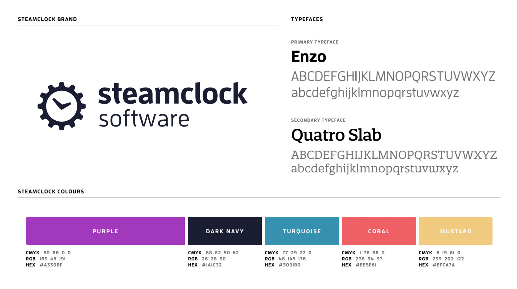
As it happened, we chose coral as one of our colours, which has since become an iPhone color and was just named Pantone Color of the Year 2019. We’ll need to keep an eye out that it doesn’t look “soo 2019” in a couple years, but for now we love it.
Tying the Room Together
Brand in hand, we filled the new site with bold colours, bold fonts, and nice illustrations. Illustration has become a big enough part of our work that it deserves its own post, but it’s proven an excellent way to communicate – without indulging my habit for excessive wordiness.
We’re rather proud of how it all turned out, and all the hard work that Erica and Brady did here to design and launch it. Of course, if you have any feedback or thoughts we’d love to hear them!
