Designed
Strategy, UI, UX
Developed
Swift, Shopify
Delivered
Under 5 months
Subscribers, worth their weight in chai protein powder, deserved a delightful app.
Wellness as a Service.
Since 2015, Ora has been growing a business selling quality plant-based supplements. They’ve built a name for themselves in a highly competitive space using data-centric decision making, the power of Shopify, and an obsession with customers.
Ora’s challenge for Steamclock was to build a high-quality iOS app for their core subscriber base, something that would make managing subscriptions easier and provide a delightful touch point. Working closely with Ora’s brand and web design partners, Onbox Creative, we set out to take Ora’s clean but irreverent brand and translate it to a wholesome mobile experience.
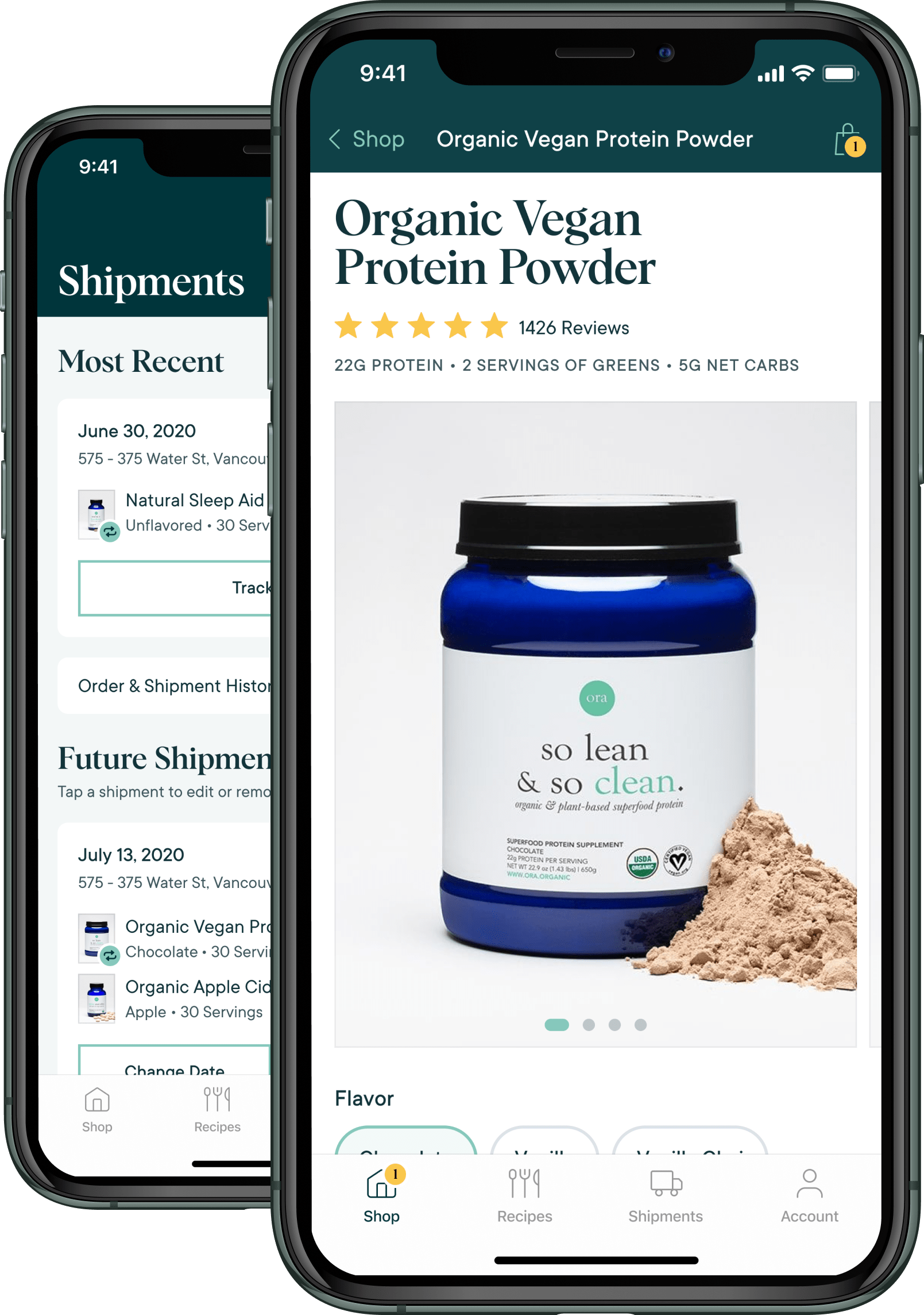
Commerce that just works.
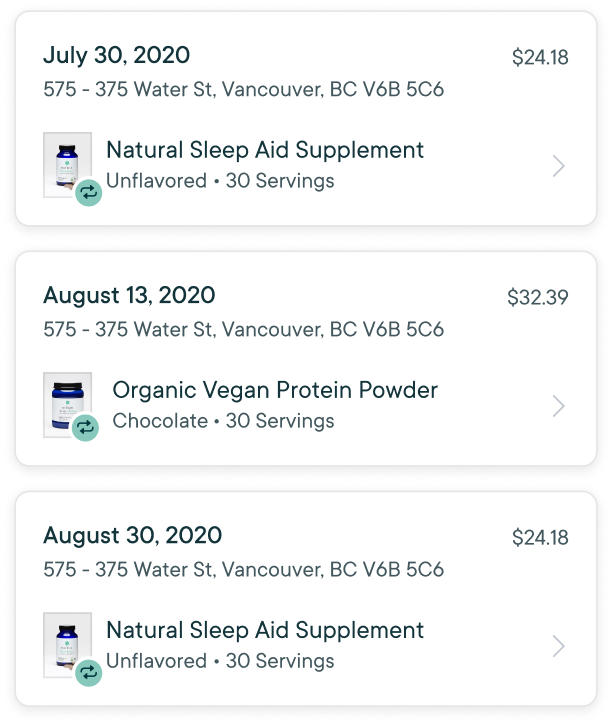
Beyond the many pieces that make up a modern eCommerce business – product variants, discount codes, reviews, shipment tracking, payment integrations, all the fun stuff – the Ora app needed an excellent subscription management tool. We’ve worked on a lot of SaaS products so we’re no stranger to subscriptions, but our mission here was to support all the variables that go into physical goods purchases, in multiple subscriptions to multiple products each, each repeating on a different delivery schedule – modifiable at any time.
Oh, and to make it all feel clear and simple.
Simple, right?
Luckily, we enjoy a challenge. Especially one where the end result is a clear, pleasant UX for customers. Our product team worked iteratively with Ora and their beta testers to refine and simplify the core interactions around subscriptions. The end result was not only a usable mobile app, but lessons learned that would go on to inform iteration and refinements for their core web app.
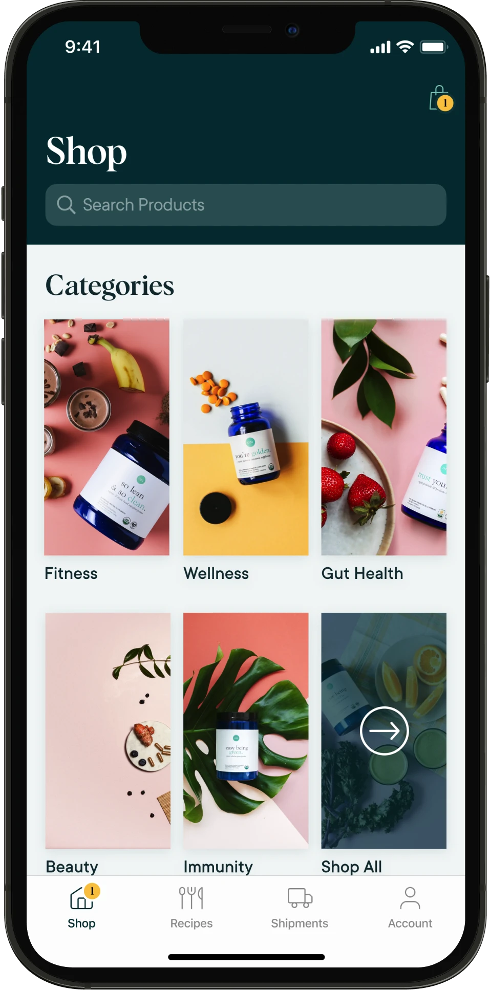
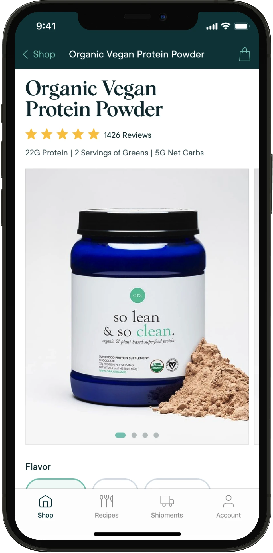
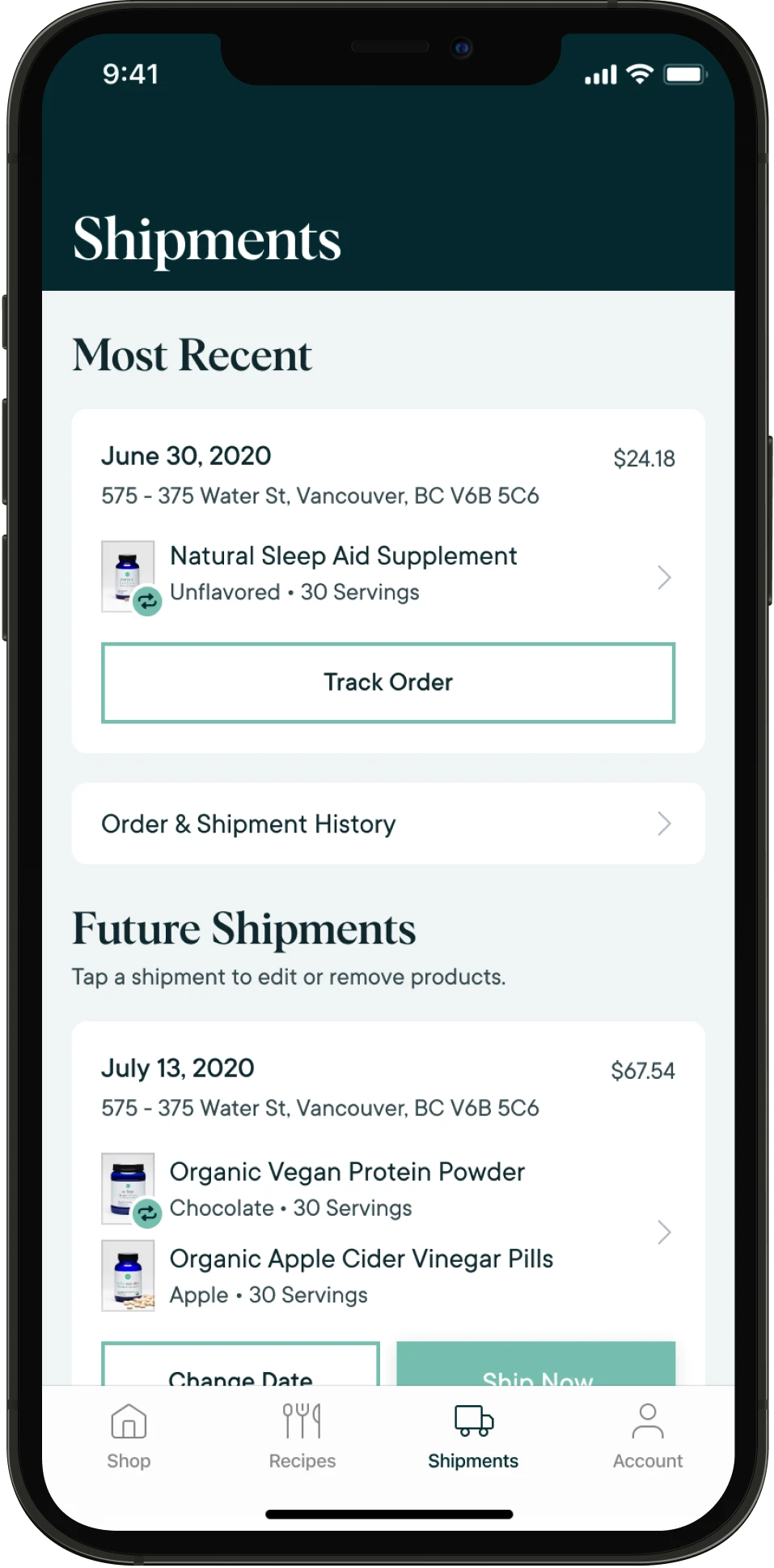
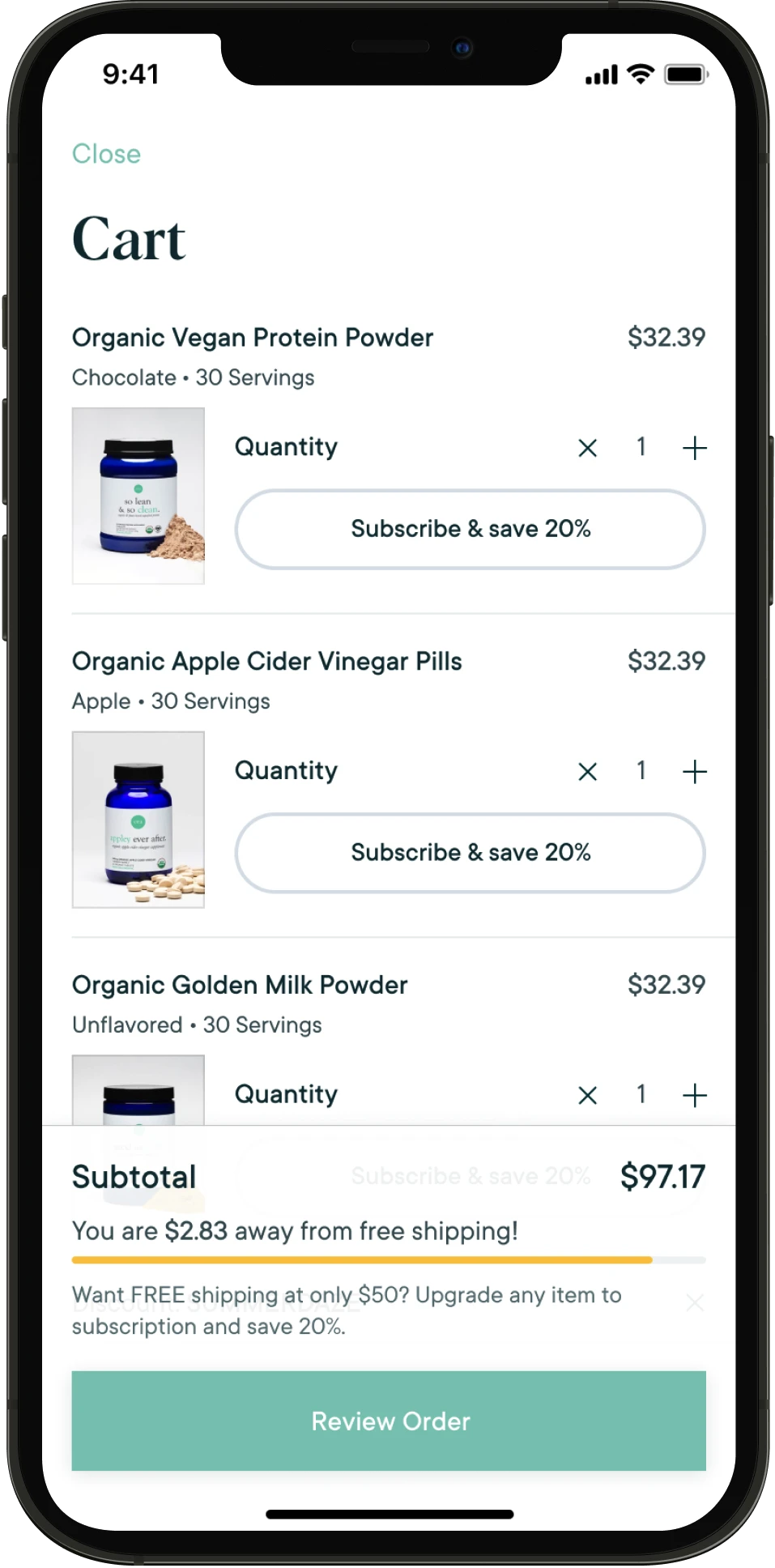
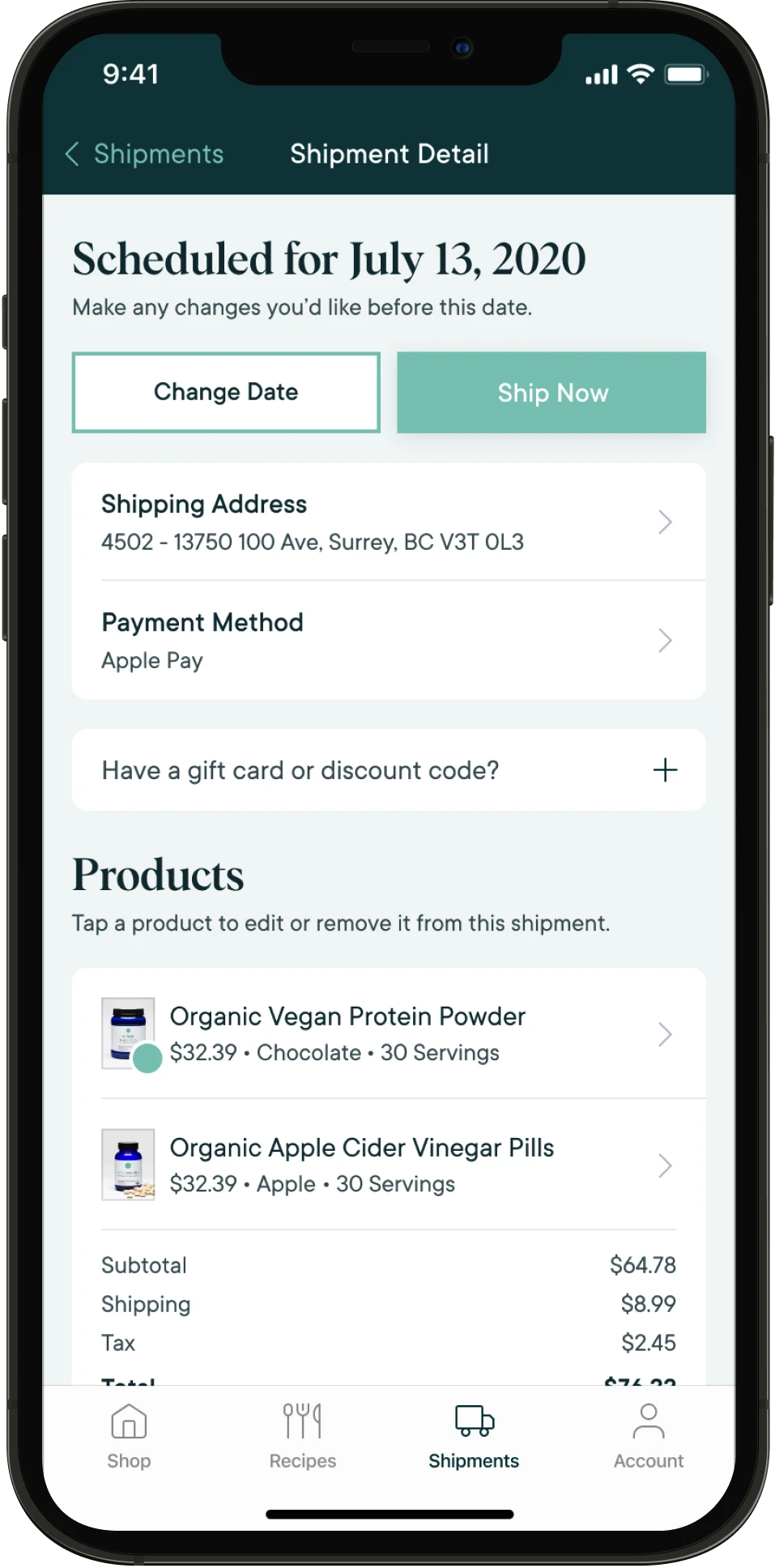
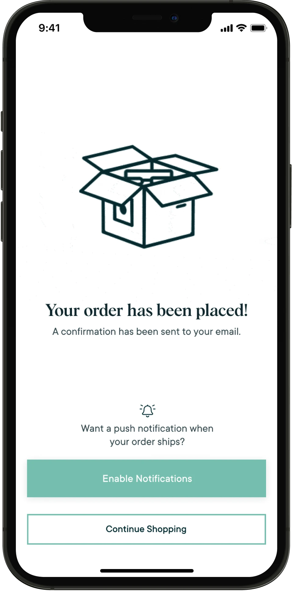
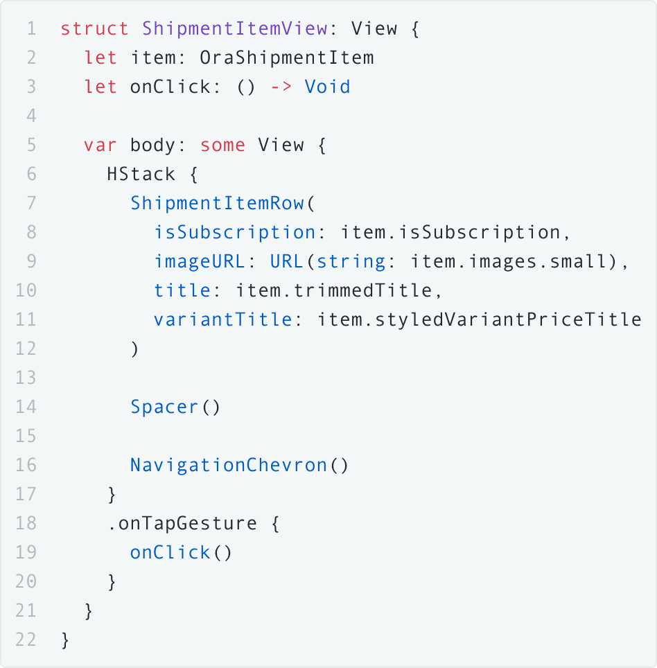
A cup of Shopify, a sprinkle of SwiftUI.
While React Native is a common choice for commerce apps these days, the Ora team wanted to stand out from the crowd with a premium native UX. Using Shopify’s Buy SDK and a modern layer of SwiftUI, Steamclock built performant and intuitive flows to deliver an experience that felt distinctively nice.
Of course, integrating APIs from a half-dozen different service providers into one cohesive app only works stably and consistently if those various integrations behave in a stable and consistent way. That’s why we wove thoughtful logging, reporting, and customer feedback functionality into the Ora app, ensuring any problems in the field could be acted upon right away.
Making it easy for customers to be green.
Once an MVP app is in the hands of increasingly-happy users, we love to turn our focus to polishing and refinement. Working with Ora’s team through their business goals and priorities, we shipped two dozen iterative updates for the app, adding desirable features – recipes, for one – and adding bits of delight to key interactions throughout the app.
An animation here, a nice transition there, a smoother payment flow here, and before you know customers are feeling well inside the app too.