Designed
UI/UX
Developed
iOS & Android Native
Delivered
Over 100,000 downloads
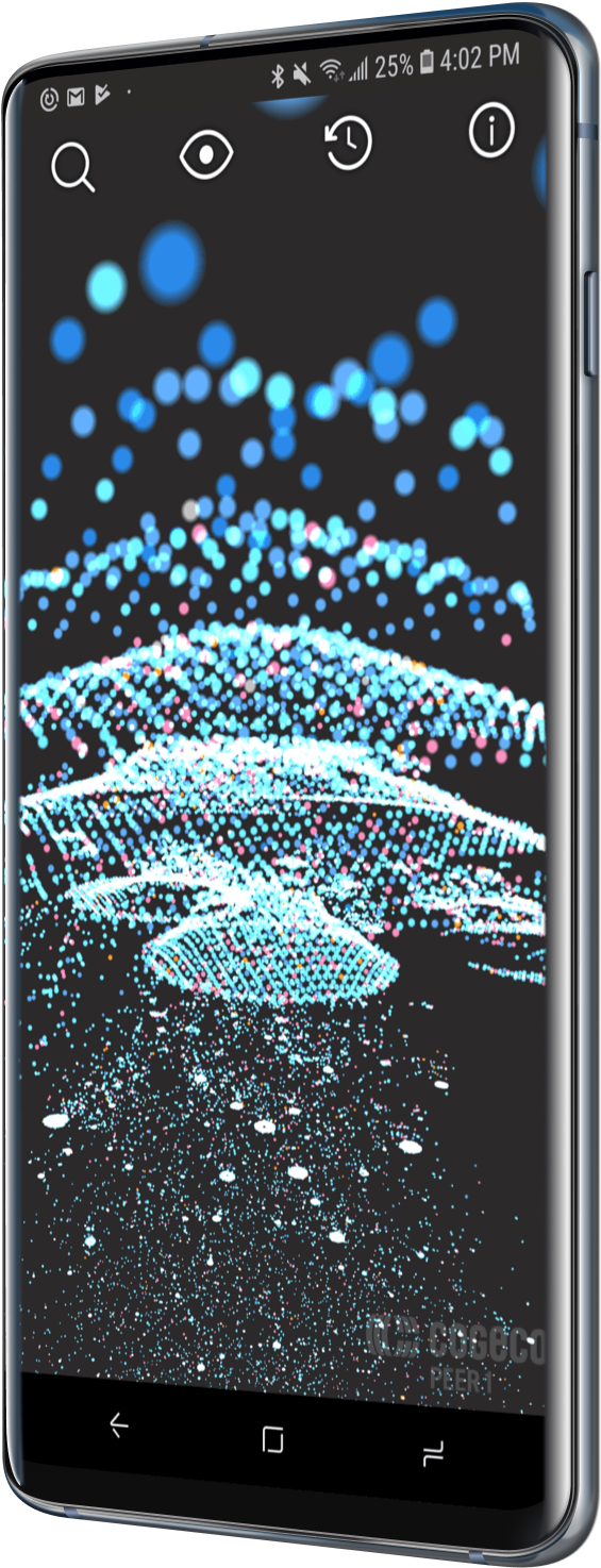
Peer 1 Hosting wanted to launch an interactive, cross-platform, 3D map of the internet – in 3 months.
How do you map the internet?
The goal was to build a striking experience: interactive, beautiful, and worthy of press attention. To get there, we needed data – and lots of it. Enter data scientist Jeff Johnston, an expert at interpreting data supplied by CAIDA, the organization that monitors internet traffic. With that data – and a healthy helping of math – we had a wealth of raw information about how the internet worked.
The next step was turning that into something curious minds could explore. We started by building a cross-platform engine for navigating tens of thousands of internet nodes, beautifully bringing the data to life. Since a delightful user interface was a key requirement, we then built a platform-specific native UI on top of the visualization. The result: a seamless experience on iPhone, iPad, and Android.

First demo, then iteration.
With Peer 1's team excited by the success of the initial prototype, we were given the mandate to add more interactivity and "flair". We designed a more striking UI, and added live data visualizations. Then we built a way to visualize the rapid growth of the internet over the years, a search function, and color coded key nodes. Next, we implemented a fun “you are here” feature so users could locate themselves in the vast space that is the internet.
To top it all off, we added a traceroute function, which mapped the sometimes-surprising path between your current network and any other node on the graph. This meant taking on a fully custom traceroute implementation in C++. Sometimes, a magic moment takes a bit of elbow grease.


Peer 1 "Map of the Internet" apps gets a Gearhead rating of 5 out of 5! Outstanding!

This isn’t an app you’d use every day, but it is a beautiful way to show someone what the internet looks like.

This fascinating app represents the Internet and highlights its different aspects.
The internet map hits the internet.
It’s not every day your app is featured on CNN. With six-figure downloads and an average rating of almost 5 stars, the Map of the Internet was well loved. Getting attention was the goal, and we met it. Peer 1 was soon acquired. When the app went “out of print” in the years that followed, we received a surge of fan mail. Folks wrote in from around the world, asking for information on the data, as well as permission to use the visuals in other work.
As a result, we worked with Cogeco Peer 1 to open source the code and permit other uses. In the end, the Map of the Internet was later used in both a science textbook and an exhibit at London’s Science Museum. Not too shabby for a project that started out as just an ambitious goal and a mountain of data.
Fantastic response and a great project. And an even better team to pull it all off!Rajan Sodhi – Peer 1 Network