Designed
UI/UX
Developed
SwiftUI
Delivered
Under 6 months
Ridwell’s new native app makes reducing our impact on the planet a no-brainer.


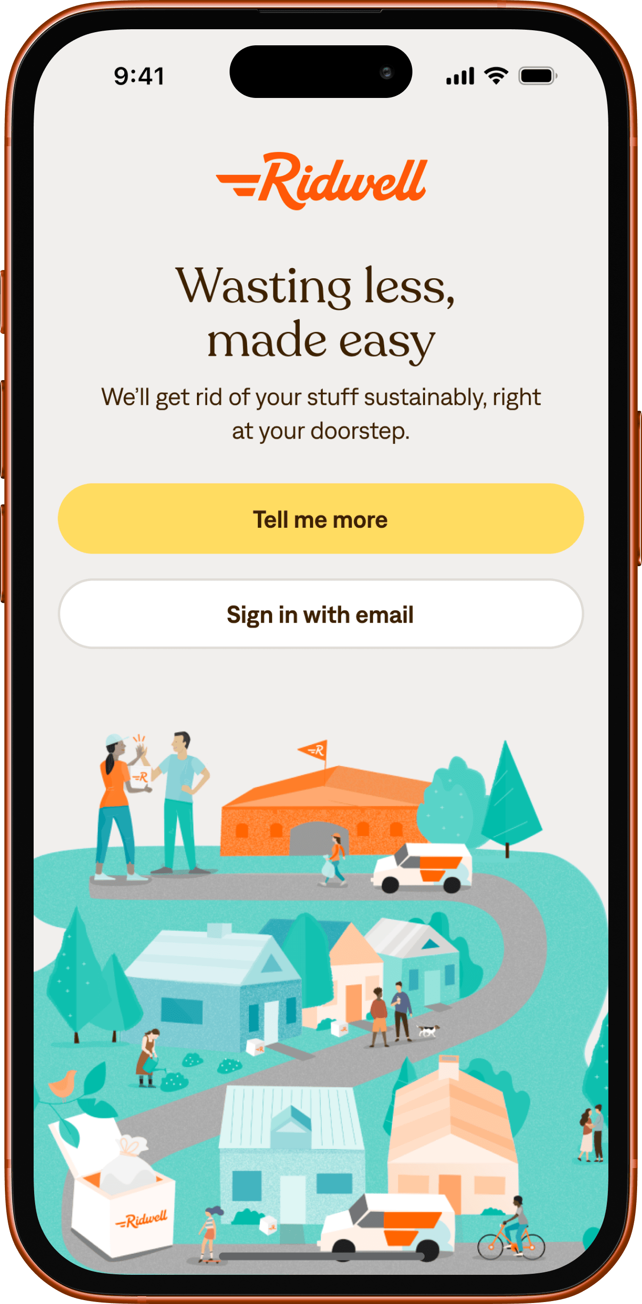
Wasting less, made easy.
Ridwell started in 2018 with a simple but revolutionary idea: make it easier to sustainably reuse and recycle unwanted stuff that’s hard to get rid of. What started out as a dad, his six-year-old, and a bag of batteries grew to a seamless web-based pickup subscription service operating in 6 major US cities (and counting) in just a few short years.
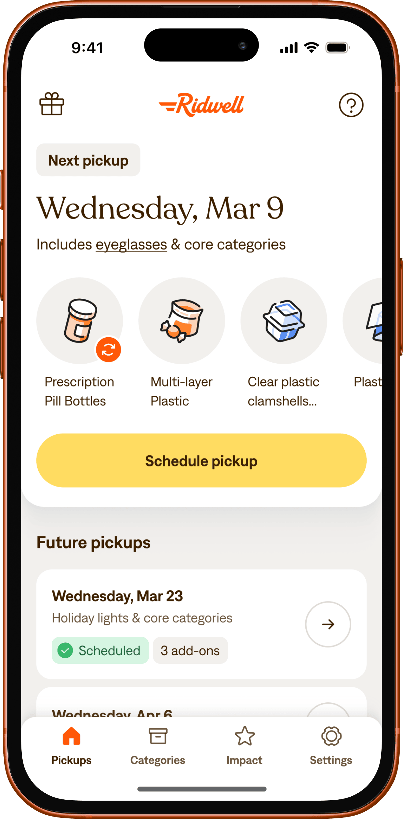
Enter Steamclock. When Ridwell approached us, they wanted to make it even easier for their members to manage their pickups, so they asked us to do what we do best: build a high-quality mobile app that’s delightful, easy, and convenient. Done well, this would also help them continue to grow their membership.
Working in close collaboration with Ridwell and our friends at Metalab, we rolled up our sleeves and got to work.
Building the right thing, and building it right.
To develop a cohesive and easy to use experience, we started by building on the UX research that had been done with Ridwell’s members about what’s been effective and what could be improved with their pickup flow. With those insights in mind, we shifted focus to the technological considerations based on our experience making great subscription-based mobile apps.
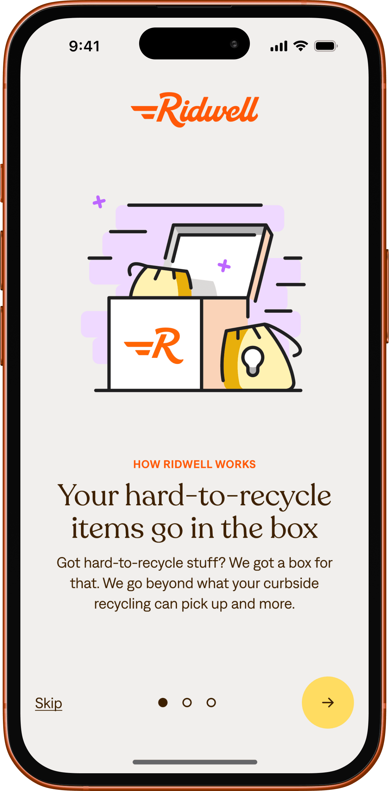
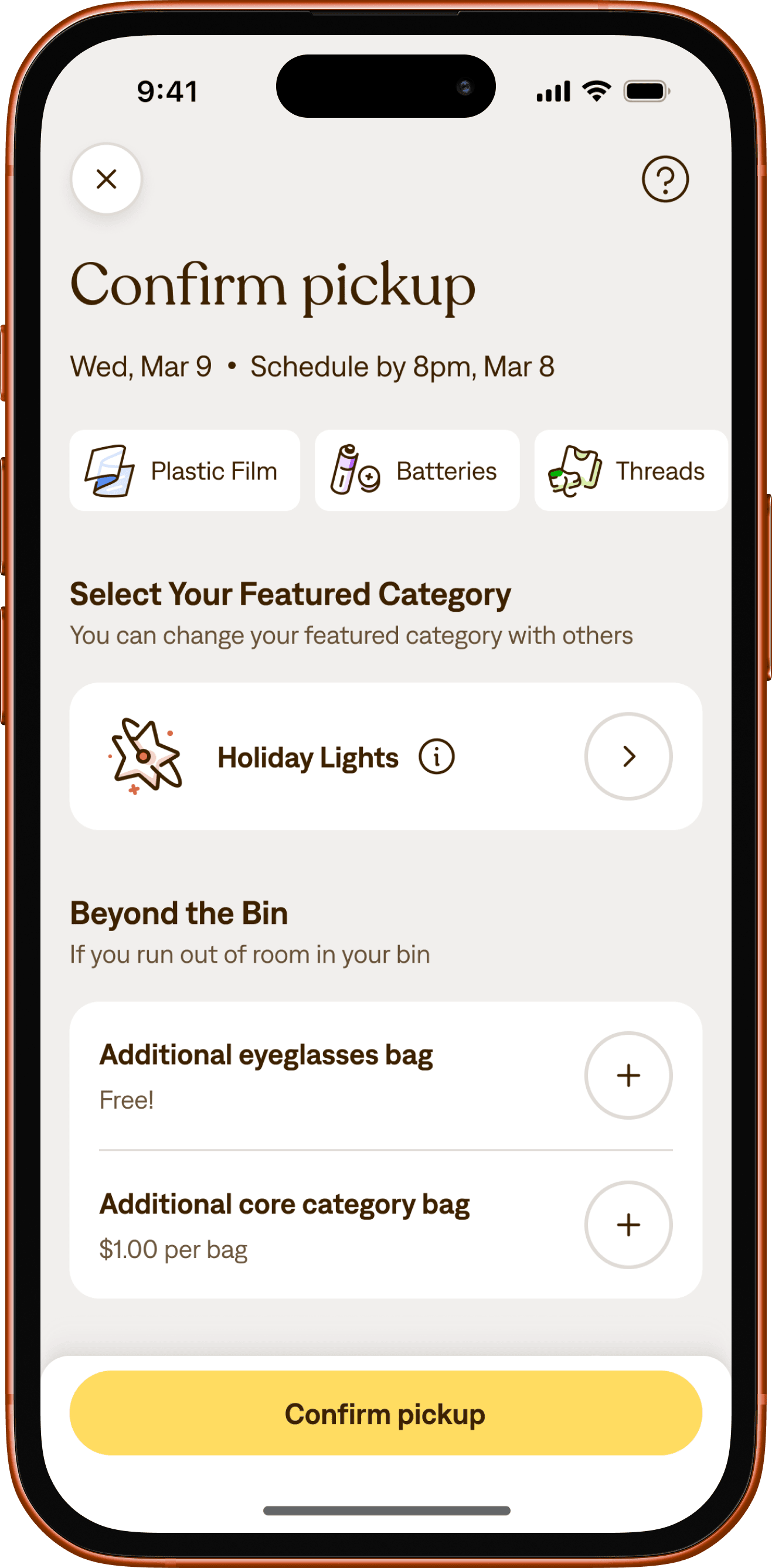
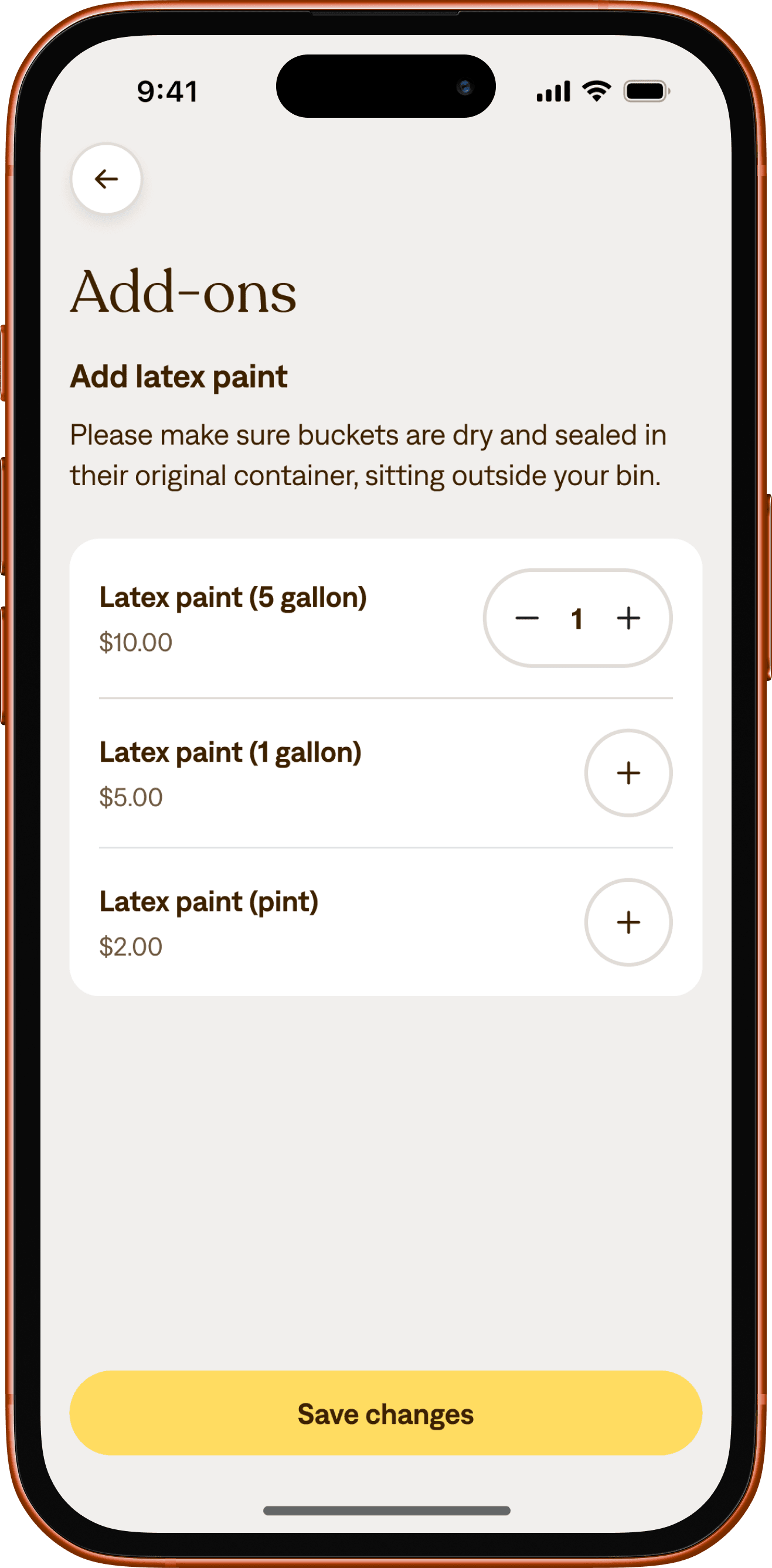
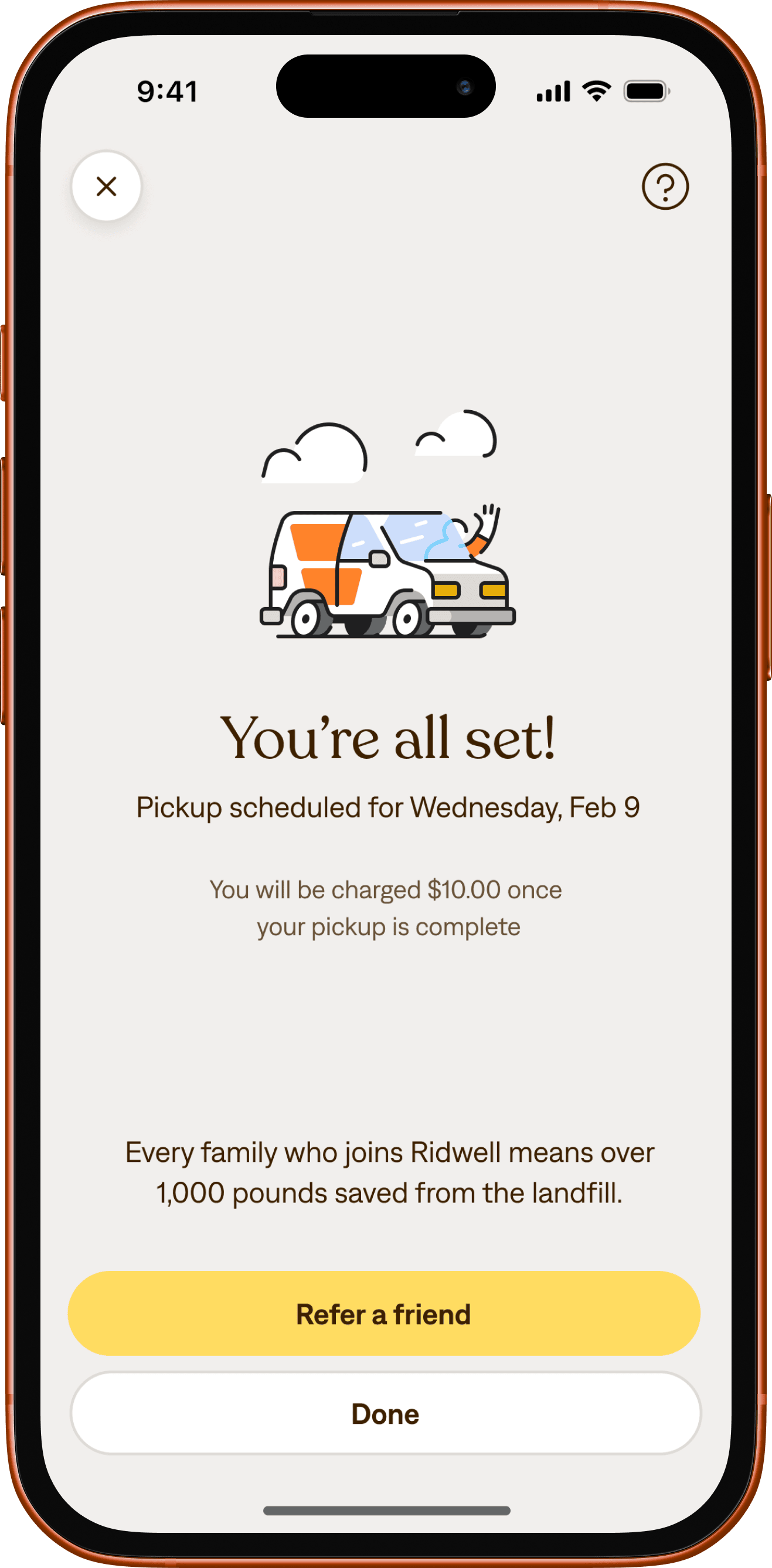
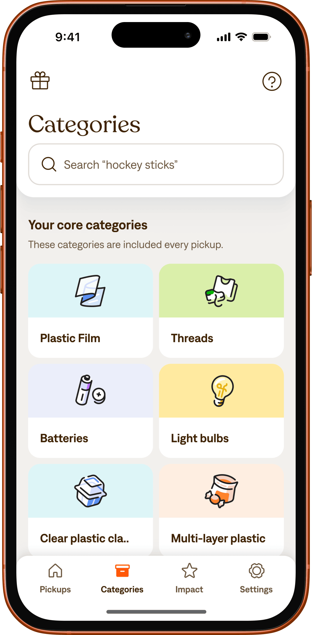
By incorporating our new open-source SwiftUI component library NiceComponents, we were able to start building rapidly, and we shipped 1.0 in less than six months. The end result was a clean (pun intended) iOS native app that offers Ridwell’s members options for managing their pickups that are easier than ever.
Ridwell’s hard-won know-how and Steamclock’s mobile expertise, combined with both teams’ commitment to user experience, led to a collaboration that's been productive and a lot of fun.
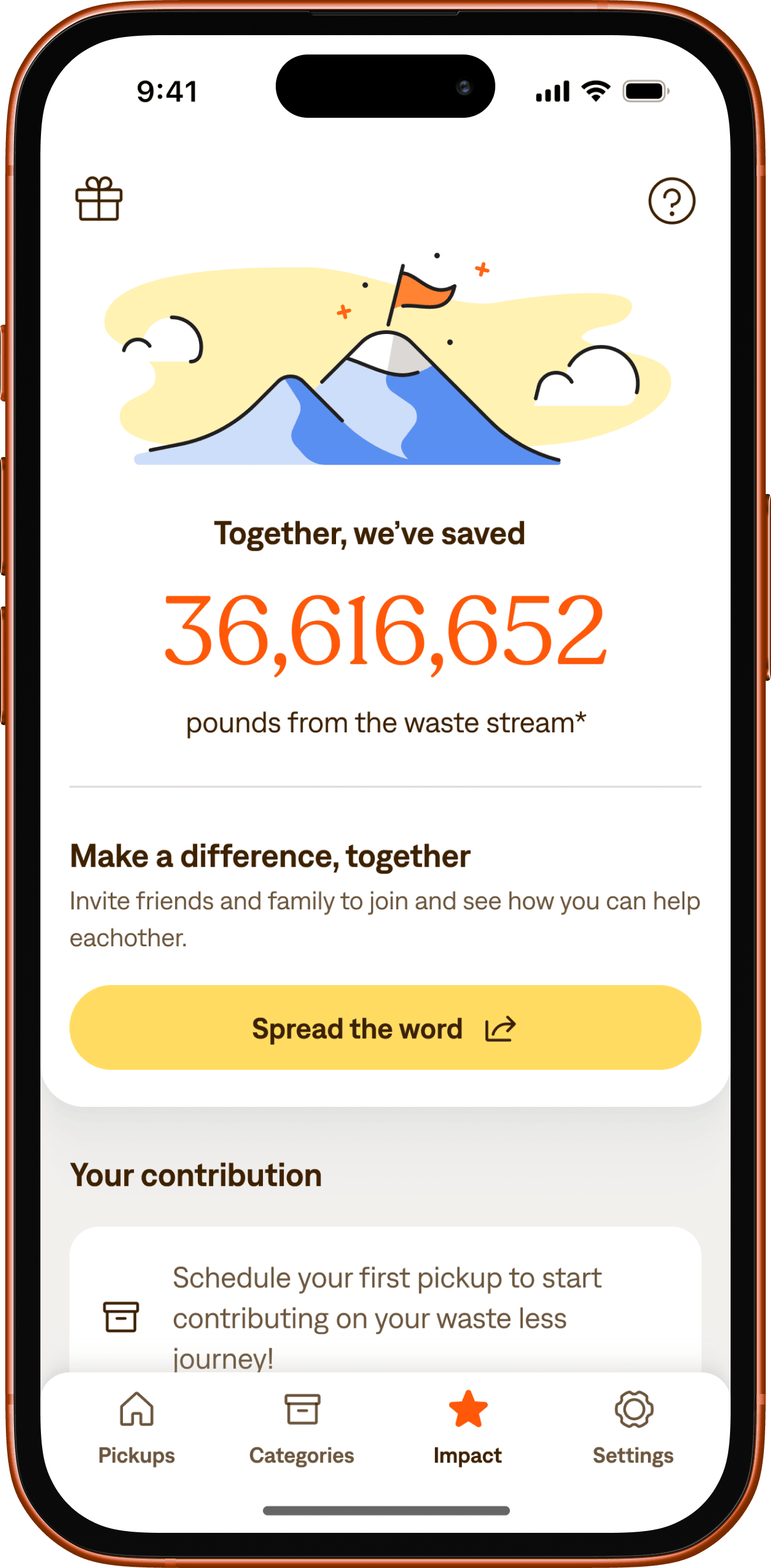
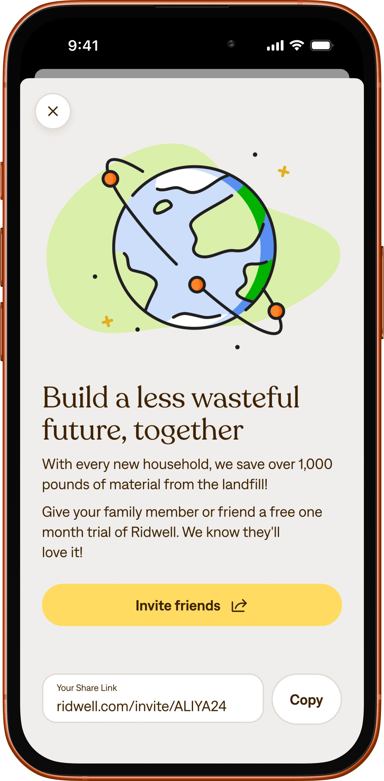
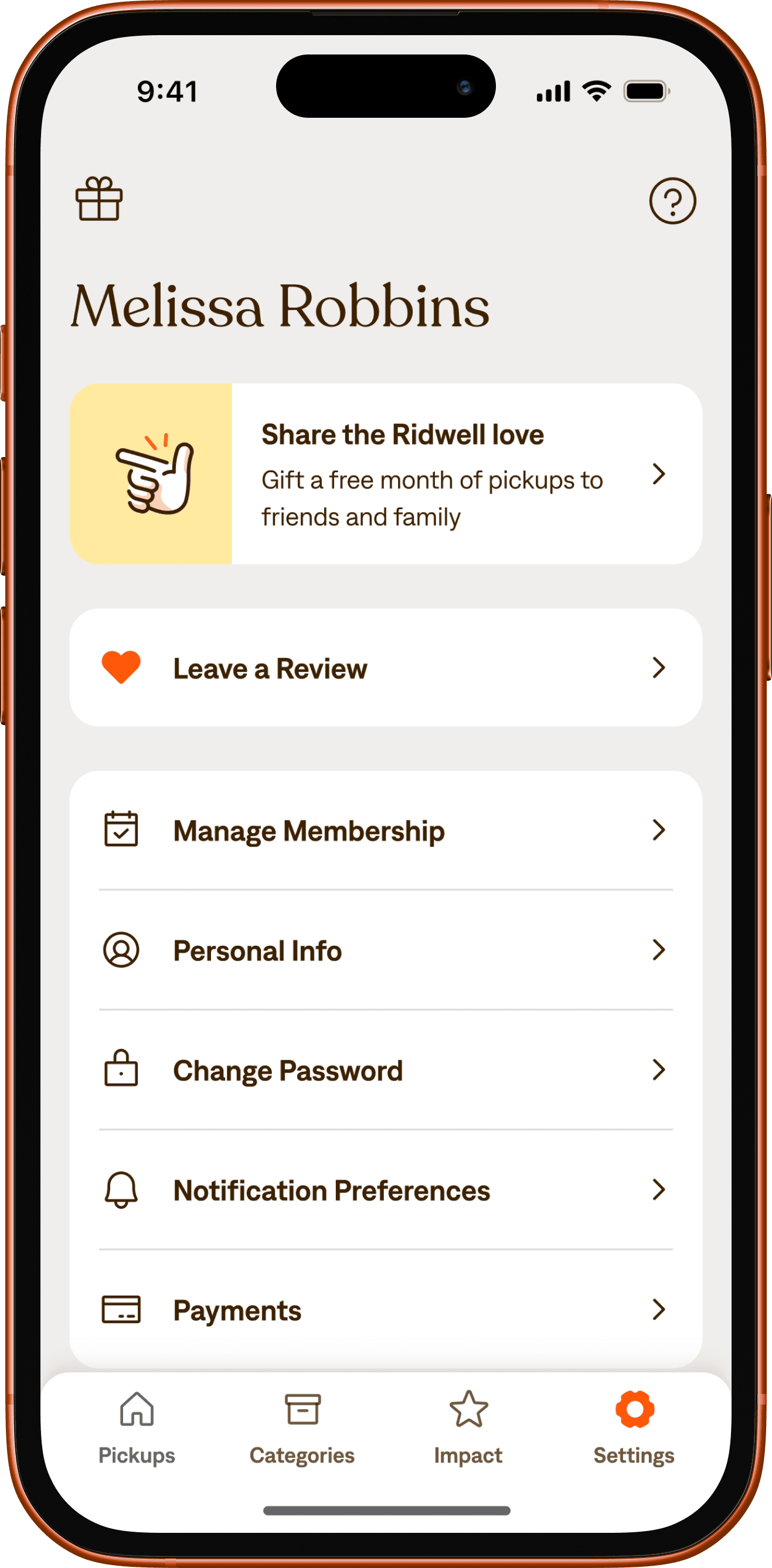
The app is really fucking nice.Aliya Marder, Co-FOUNDER OF RIDWELL

The iteration game.
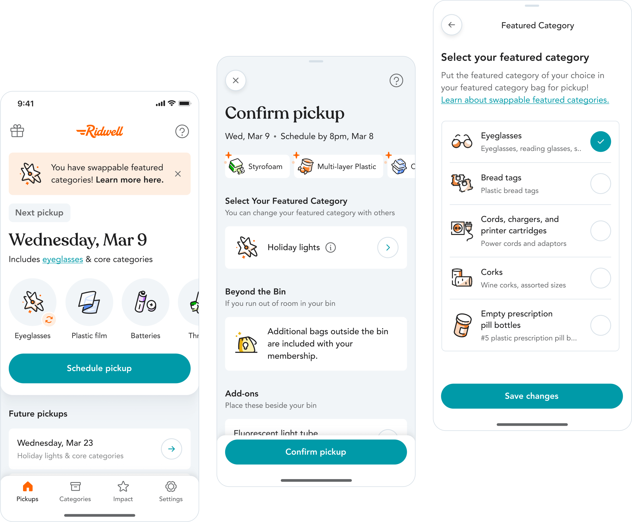
Since the launch of 1.0, we’ve continued working with Ridwell to iterate and improve their app. We conducted user testing sessions to learn more about potential pain points, and learned that some folks were getting caught up on jargon and info hierarchy. Based on those insights, we shipped simplifications to key interactions and offered more opportunities for customers to track the status of their pickups.
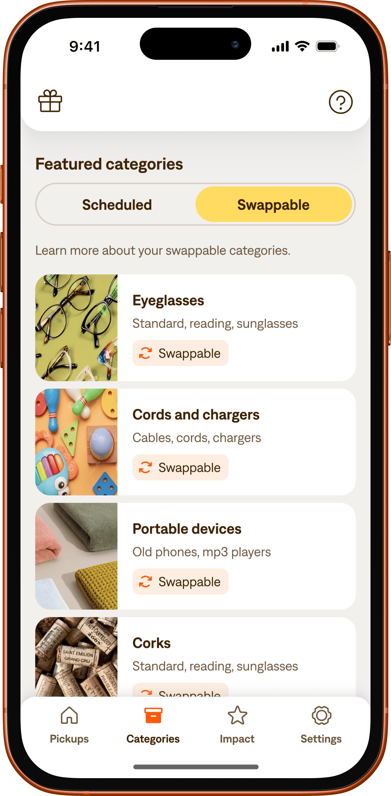
We’ve also collaborated on iteratively shipping larger features, like implementing Ridwell’s new pricing plans. With the launch of 2.0, Ridwell subscribers can now easily swap out their item categories, offering even more flexibility for their weekly pickups.
Onwards.
Over 70k successful pickups were scheduled through the app in just the first five months after the launch of 1.0, earning Ridwell a solid 4.9 star rating on the App Store in the process. In total, Ridwell has saved over 30 million pounds of waste from landfills since 2018 and we’re excited to know that number is growing! 🌱
Finding ways to reuse and recycle sustainably while supporting responsible consumption is and will continue to be critical for all of us. We’re really proud to play a role in Ridwell’s story, and to support their success as they continue their mission.