Designed
Strategy, UI, UX
Developed
Swift, Kotlin
Delivered
40+ versions to acquisition
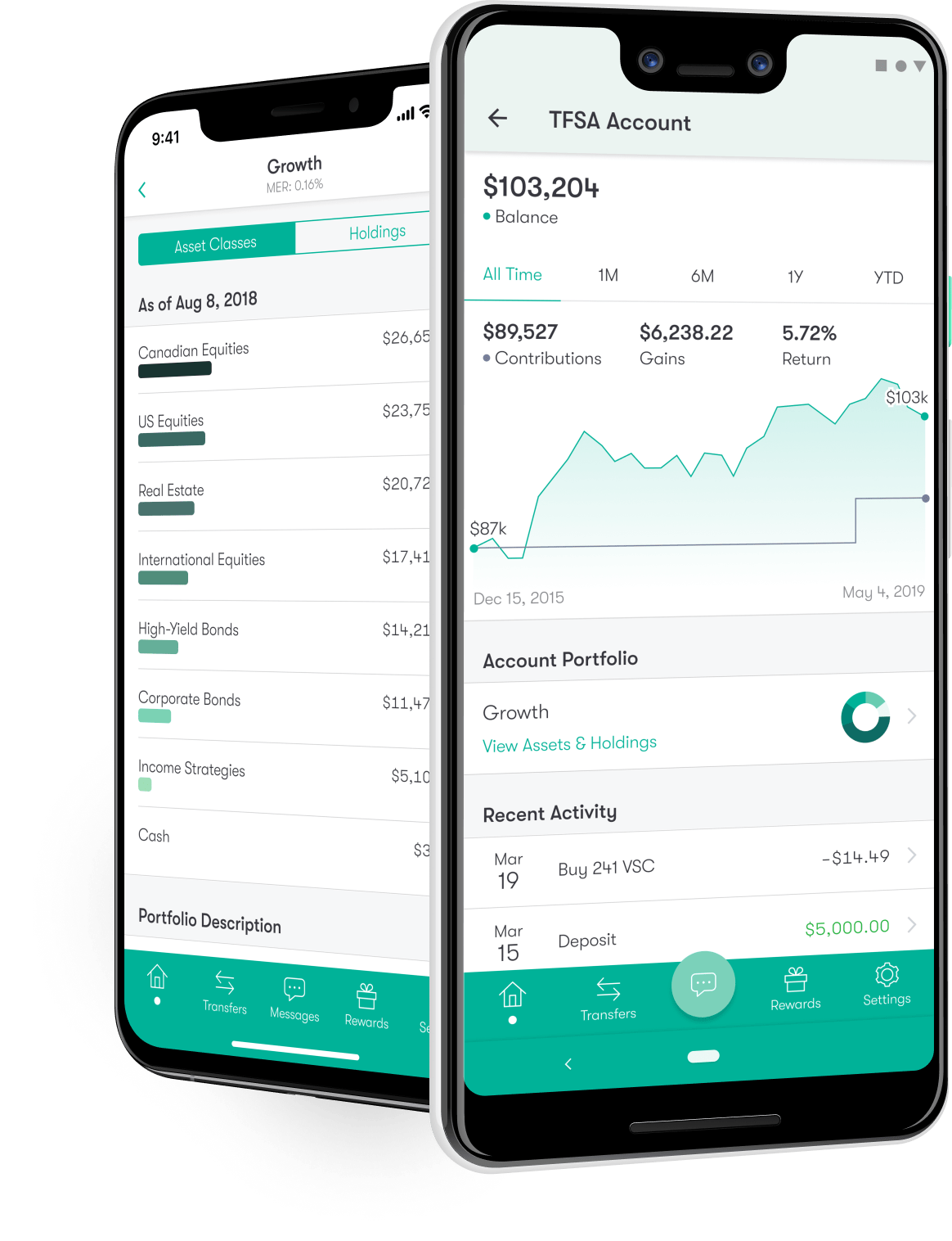
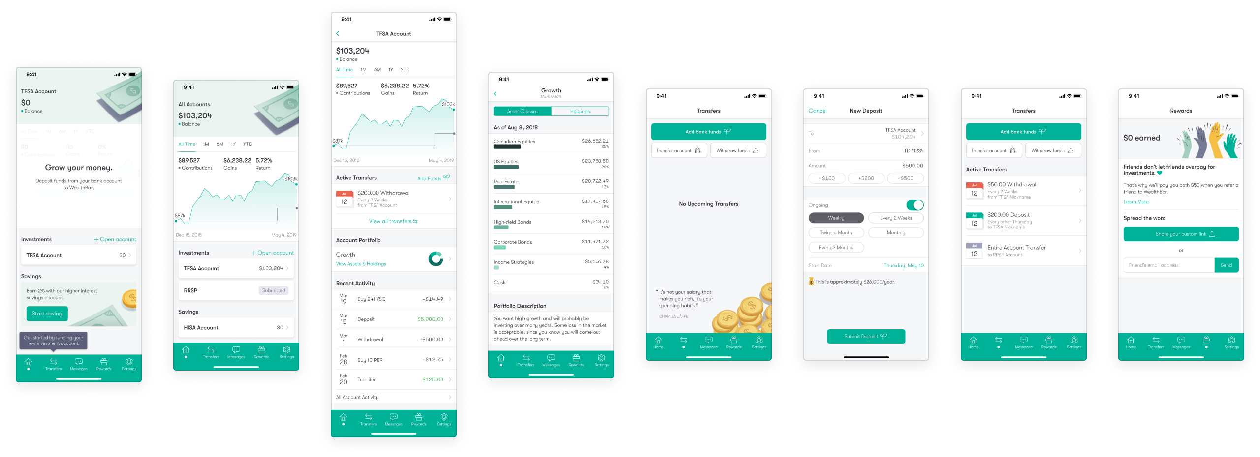
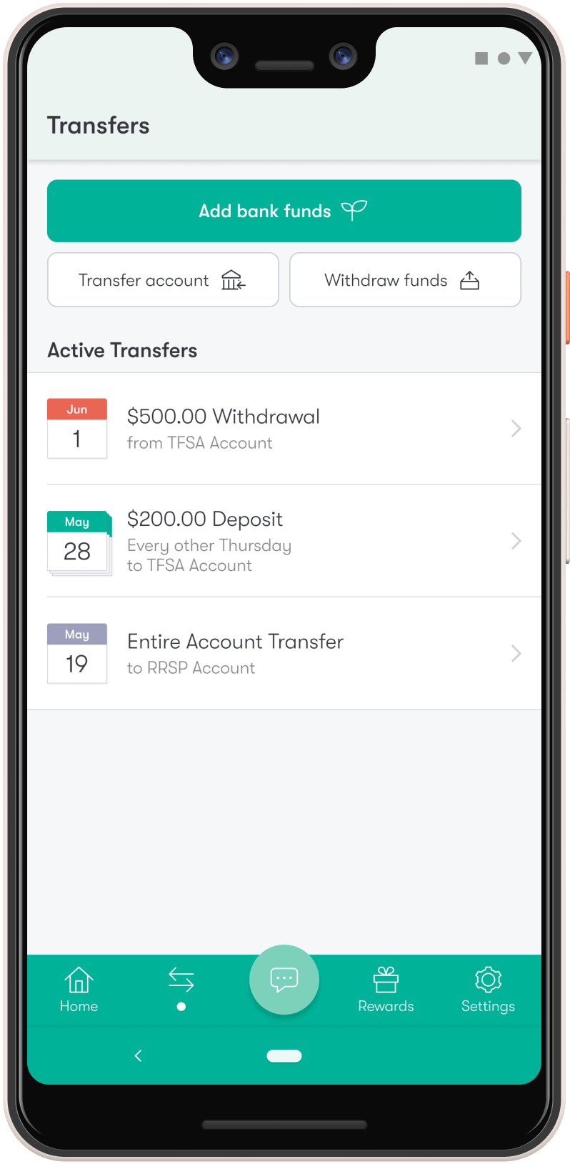
Using Swift and Kotlin, we designed and built high-performance native apps for one of the top wealth management services around.

Saving for retirement is intimidating.
Once upon a time, people had to either pay high fees for their bank’s mutual funds, or learn how to manage their investments directly on the stock market.
Luckily for savers everywhere, services like WealthBar now make this easy as pie. WealthBar invests your savings in world-class index funds, and then does the important work of keeping your portfolio balanced, healthy, and very online.

It was time to go native on iOS and Android.
Like many growing businesses, WealthBar kicked off their mobile app efforts with a quick cross-platform app based on web technology. Using Cordova, and later React Native, they were able to use their web skills to ship an MVP and validate what their customers needed on mobile.
As the business grew and WealthBar collected feedback on their mobile experience, it became clear it was time to invest in building high-quality native apps with a big focus on UX. Given that, they got in touch with Steamclock: a team that specializes in mobile design and development.
We wanted to make investing easier. So we went to the best in the west.Jonathan Narvey, WealthBar

The hard work of making it easy.
Using the existing MVP design as a starting point, Steamclock dug in to what WealthBar’s clients were asking for in an app, then went beyond that to consider what kind of features and presentation could actually help users with the core goal: build wealth.
A lot of investment apps focus on the day to day – or even hour to hour – of the stock market. Evidence shows that real wealth is much more built on the long term decisions, so we designed an app with that focus. Then, we worked across iOS and Android to bring it all to life using a loop of constant feedback and iteration.

Keeping a good thing going.
After we ship a successful 1.0, we typically either train our clients' teams to maintain and further improve the app, or we work together on long term refinements and additions.
In WealthBar’s case, we’ve continued to help steer the app through 40+ releases, adding key features, building off of WealthBar’s business goals, and keeping tabs on the pulse of the product to make sure we’re building investment apps that people love.

