Last week, iOS 7 updates of our music apps went live on the App Store. I’d like to show some of the design decisions we made in bringing these apps to the new look, and share some of what we’ve learned working with iOS 7 so far.
We started with the two app icons. Icons are a great canvas for experimenting with new design language, and having them early got our old photorealistic icons off of our home screens as soon as possible. The WeddingDJ icon’s shape turned out to feel quite comfortable on iOS 7, so Justin here at Steamclock took that layout and re-rendered it in a more modern style.
The previous Party Monster icon required a more thorough redesign. The photo-realistic 3D renders we used in the original icon were fun, but they didn’t provide enough structure for a vector-style icon. I did more symbolic take on our horned disco ball for the new icon, and to maintain the playful character I brought up the saturation and redness of the purple.
Although it’s flat in style, there’s a hint of shadow in the new Party Monster icon, a touch that I picked up from The Iconfactory's excellent xScope icon.
After WWDC, we made the call to start with an in-place restyling instead of a complete redesign. iOS 7 brings in some major new APIs and design metaphors for building UI, and we didn’t want to rush out a fundamental change to the flow of our apps while we were in the middle of a feature update.
As part of deciding to maintain the basic layout of the apps, we made the decision early on to support both iOS 6 and iOS 7. In retrospect, supporting iOS 7 only would have been a better call. The work to build and test for both systems isn’t hard, but it is seriously time consuming.
At the same time, user adoption of iOS 7 has been fantastic: according to Mixpanel’s stats, the update is on 2/3 of devices only two weeks after its release. Even better, a user who hasn’t updated will now be offered the last version of your app that supported iOS 6. Given that apps as large as the New York Times are requiring iOS 7 already, we’ll be joining that club soon. In fact, all of our in-progress apps for clients are iOS 7 only.
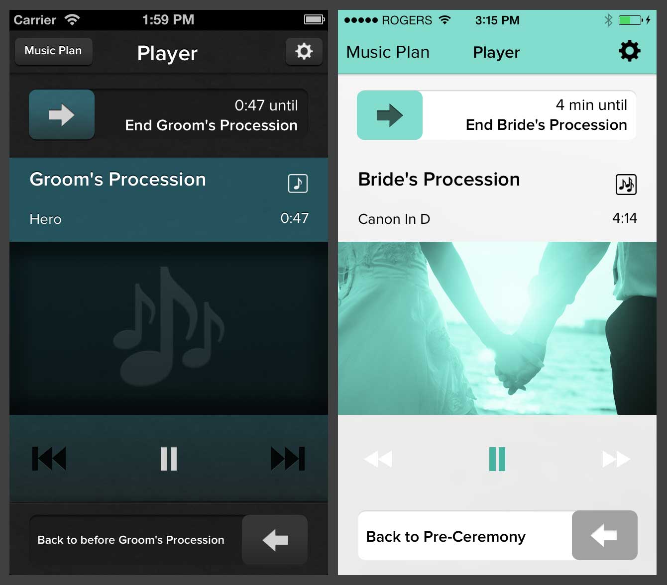
The white palette is such a good fit for a wedding app that it seems strange we ever had a dark look.
For WeddingDJ, the move to a white-centric colour scheme is a big improvement, and in retrospect it seems crazy that we didn’t already use white. Although a number of professional DJs use WeddingDJ, our core market is people who are themselves getting married, and the white and robin’s egg are a great fit for the wedding genre. We have two sections of the app that we need to differentiate from one another, so our setup screens show the system standard white navigation bars, and our playback screens show the branded blue navigation bar pictured above. On iOS 6 this would have looked strange, but on iOS 7 it feels natural.
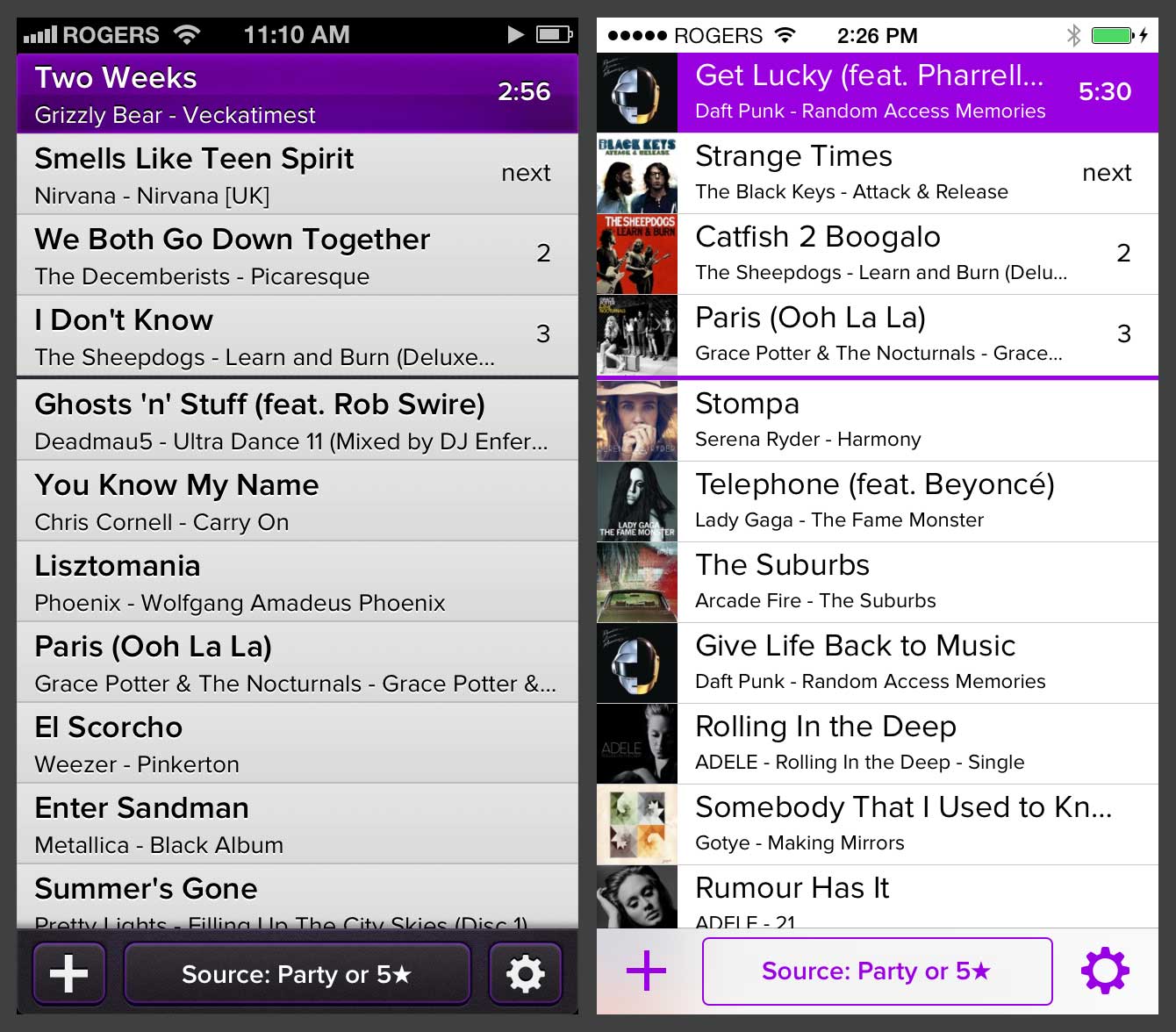
Minimalism fits in on iOS 7, but it may seem dated in a year or two.
Party Monster has a minimalist control layout which translated reasonably well to iOS 7, but left the app feeling terribly sparse. We originally dismissed album art on the player screen as being unnecessary, but in the spirit of putting content first we caved and put it front and centre. For now, we’ve kept Party Monster almost completely standard in terms of following the iOS 7 look and feel. This is extremely easy to acheive since we use native UIKit for all our internal apps. Unfortunately since this approach is so easy, it won’t be enough to stand out from the crowd in the long term.
In addition to the visual changes, we have a number of back-end features that launched with these updates, including supporting Sound Check, start and end times from iTunes, Genres, and a number of other user-requested improvements.
Looking ahead
As we settle in and the developer community builds a sense of what a fantastic iOS 7 app looks like, we’d like to revisit Party Monster’s design again. In time, Party Monster will be back to pushing the envelope in terms of visuals, without falling into aping physical textures and gradients. For now, a faithful iOS 7 design looks new and fresh, and we’ve gotten great feedback from users on it.
Overall, we’ve really been enjoying the process of designing and building for iOS 7. As enjoyable as a visual refresh is, though, we’re more excited about what comes from building an app from the ground up using the new navigation methaphors and APIs. In the next 6-12 months we’ll see the first apps launch that are truly born of iOS 7: not redesigned apps, but rethought based on what we’re all learning. It’s going to be great.
