At Steamclock, we’re firm believers in the power of microcopy: the tiny phrases that lead customers through your app. Product design is all about communication, and an extremely cost-effective way to make your app communicate better – and thus retain, convert, and delight better – is to refine your microcopy.
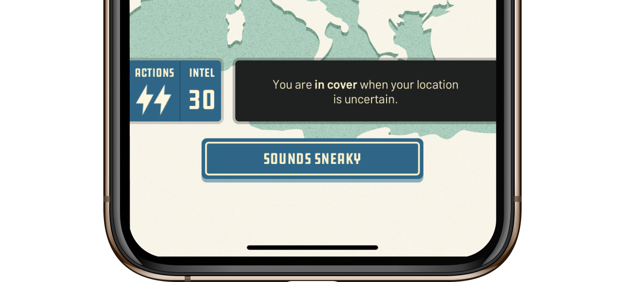
Two Spies goes to great lengths to keep its tutorial text concise.
A key part of launching any new app is triaging and prioritizing common and high-impact user feedback. A couple years back we launched a finance app that was well received by users, but one of the most common complaints was people reporting that they couldn’t see their transaction history.
The thing was, we did have a transaction history feature – and as far as we could tell it was working. Pretty quickly we tracked the issue down to the fact that the server was only returning 3 months of data, which wasn’t enough for accounts that were used infrequently and thus had no recent transactions.
Naturally, we prioritized getting the server team to add support for longer-term transaction data. However, this turned out to be a bit involved, and it would take some time before it was implemented. In the meantime, “My transactions aren’t loading” continued to be one of the most common types of feedback we received.
Knowing microcopy is one of the fastest ways to improve UX, we loaded up the app and reviewed our message for when there were no recent transactions. We brought up one such test account, and the app dutifully reported:
“There are no transactions yet.”
But that wasn’t quite true, at least not in this case. This is a really common microcopy problem: the message implied that missing data didn’t exist, but it did – it had just been filtered out. We soon pushed an update for this case that explained much more clearly:
“No transactions from the last 3 months.”
Just like that, the complaints stopped. We went from receiving frequent annoyed reports that transactions were broken, to occasional kind suggestions that it would be nice if people could see more than 3 months of transactions. Everybody rejoiced.
Improving your labels
While this was an extremely easy UX win, it takes time and attention to write and maintain descriptive and context-aware messages. First, you need a product team with a fairly deep understanding of the product and how users think about it, enough that they can recognize opportunities to refine the copy. User testing is of course very helpful here.
You also need a shared understanding that brief, succinct text is worth the extra effort. Every extra label and word is a potential distraction and will discourage people from actually reading your copy.
More subtly though, context-specific microcopy needs some ongoing maintenance to ensure it stays accurate. When our client’s server team later added support for more than 3 months of transactions, we needed to coordinate with them to update the corresponding message in app. When coordination like this is impractical or unlikely to happen seamlessly, a more generic message can work. We could alternatively have just said “No recent transactions”, which isn’t as helpful to users but is less likely to “break”.
On the whole, iteratively refining and improving the messaging in your product is a great investment. While larger and more mature products often have a “growth team” that looks at microcopy as it relates to onboarding users and driving upgrades, anybody on your product team can have a positive impact just by spending a little bit of time thinking about what messages and button titles users are being shown. Having a product team that’s encouraged to use, think about, and really try the product is a big part of building something special.
We need to be exercising our apps not just from a functionality perspective, but from a perspective that asks, “What do people think when they see this? Will they actually read all of this?”
Bonus points if you actually ask them!
8 starting points for refining your app’s microcopy
- What are some user behaviours you wish happened more often?
- What are frequent points of confusion? How do first-time users get exposed to those failure points in the app?
- How would a user who is aggressively skimming your app’s interface – not reading more than 6 words in a row – experience your onboarding process?
- How could some explanations or messages be more succinct?
- Are there features or actions that are underused because they’re worded in a non-obvious or unappealing way?
- Are there verbs that could be more thoughtfully named? Is there any generic “Continue” or “OK” buttons that could be clearer or more compelling?
- Is it possible to reduce the length of your onboarding or “tour” and sprinkle “just in time” messages and hints in the right places instead?
- Review a portion of your app’s errors and feedback messages, asking yourself for each message if it’s actually always true in the cases where that message is shown.
