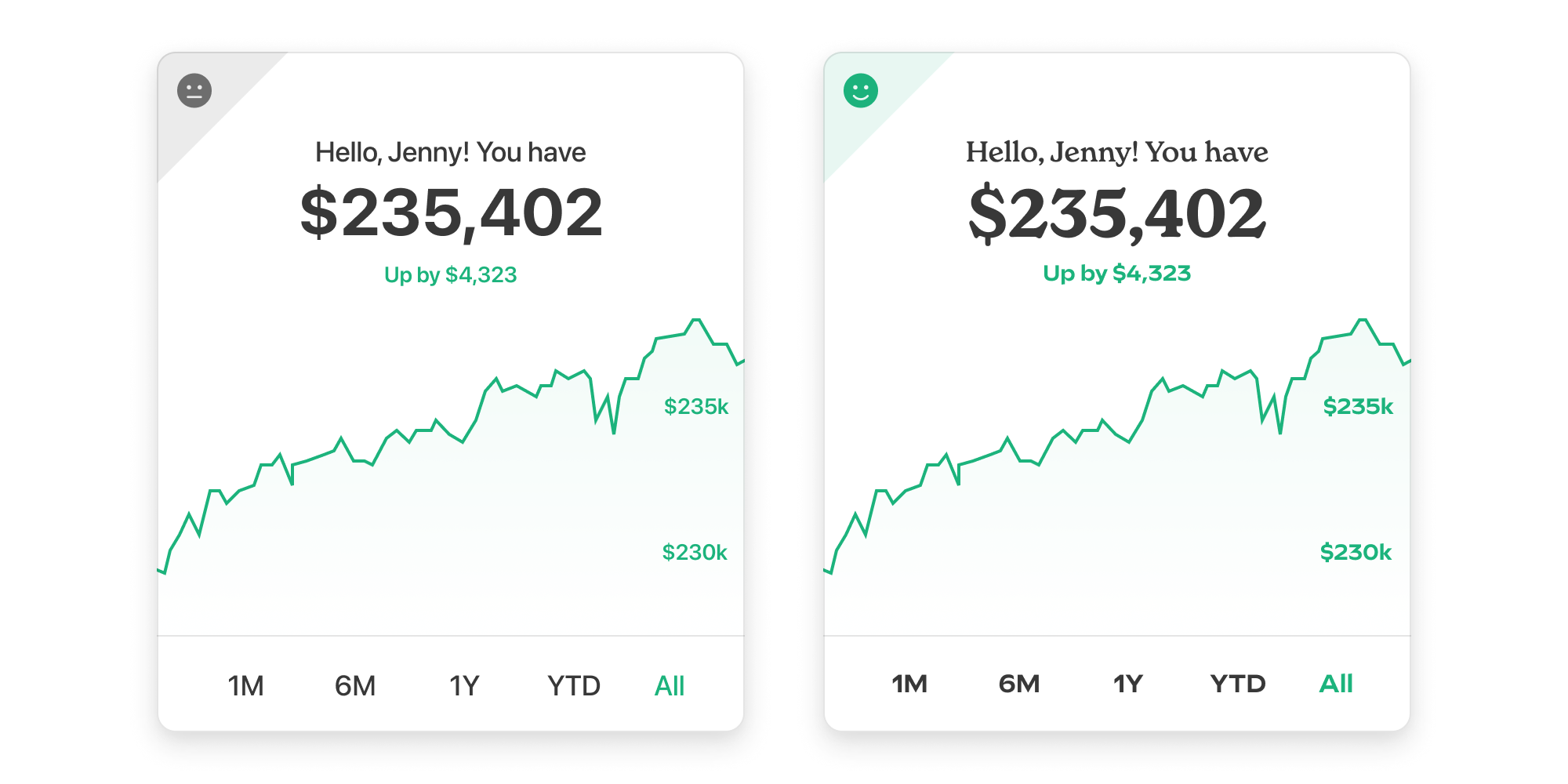
Picture this: your design team, potentially an external agency, is excited about the excellent new fonts they’ve proposed for your brand, and they’ve secured licenses for print and web use. The new typefaces do a great job conveying your brand voice to your customers.
Fast forward a few months, and your mobile app team is ready to ship an update with these new fonts, and need an app-specific font license. Surprise! You discover that the cost of licensing for mobile is 2x, 3x, or more what you expected. Or, worse, the type foundry doesn’t even have an option to add an app license to cart, and has instead left behind this cryptic message: “contact the font designer for app pricing”. 😱
Not wanting to blow your budget at the last minute, your team concedes to swapping to a cheaper, alternate font — maybe even a system font — ultimately paying the iron price of an inconsistent brand experience across platforms, not to mention the designers’ ire.

Don't sacrifice your product's brand personality if you don't need to.
What to look out for
So, what can you do to avoid this? Whether you’re in charge of exploring fonts, or working with an external branding team’s choices, it pays to do some extra research at the start. If you know you need a mobile app, evaluate app licenses alongside web and desktop and factor them into your budget. But what do you need to look out for?
First, take stock of what you need. How many font weights or styles are used in the app? The cost difference between getting a license for a single font versus its’ entire family can be vast. Like $100 versus $10,000 vast.
Second, go directly to the font foundry’s website and determine what pricing structure they use. Some foundries use tiered pricing determined by how many monthly active users (MAUs) or total downloads the app will potentially have. For example: $320 for 10K users a month, $1800 for 100K, $17k for 10M, so on and so forth. Or alternatively, the tiers might be based on term: $8,640 for 1 year, $36,720 for 5 years, $43,200 for perpetuity for an entire font family.
Other foundries opt for a simplified approach, offering to cover everything with a single commercial app license. Instead of looking at MAUs, total downloads, or term, they might look at how many developers or designers in the company are using the fonts instead.
Regardless of how pricing is determined, be sure to check the fine print in the EULA (End User License Agreement). In doing so you may discover potentially surprising stipulations, like one that states an upgrade of the App License is required for every major release update of the app (like going from 1.0 to 2.0) — such is the case at foundries like Typofonderie.
Great design requires great type
Thoughtful type is part of every strong brand. But if you’re not careful, you can hit unexpected costs and even compromises when it comes to bringing type to mobile apps. So avoid headaches, and do your research up front! And here’s a little bonus: if you purchase desktop, web, and app licenses at the same time, sometimes you can even get a bulk discount from the font foundry, as a little treat. Now those are some real dividends.
